
PATH
MOBILE APPLICATION CASE STUDY

completion:
role:
prompt:
user:
applications:
April 2026 (4 months)
UX UI Design / Brand Development / Visuals / Interaction / Research
Design an app for a camping supply brand to advertise and sell its products
Outdoor Enthusiast (Amateur & Experienced)
Figma (Design & Make), Twinmotion
Completion: April 2026 (4 months)
Role: UX UI Design / Brand Development / Visuals / Interaction / Research
Prompt: Design an app for a camping supply brand to advertise and sell its products
User: Outdoor Enthusiast (Amateur & Experienced)
Tools: Figma (Design & Make), Twinmotion
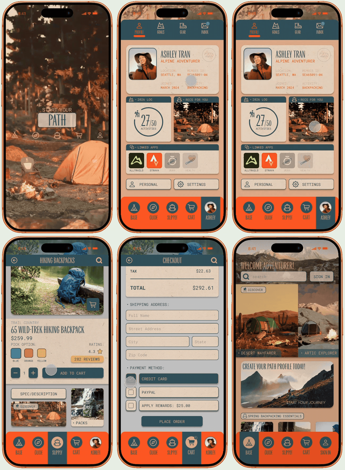
USER FLOW - PROFILE PURCHASE
Introduction
PATH is a mobile outdoor retail application designed to make exploration more accessible, informed, and connected. This case study documents the full design process in addressing the issue:
Outdoor retail platforms fail to personalize the shopping experience in a way that helps users feel informed and confident in their gear choices.
Goals
The four goals established at the outset of this project served as the north star for the purpose of the application. The high-fidelity prototype demonstrates how each goal was addressed:
Create a guided purchasing experience that helps users make informed outdoor gear decisions
Develop a visual system that establishes a consistent UI language
Design an intuitive architecture that is understood by all user types
Support ongoing engagement tools that extend beyond one-time transactions
Research & Discovery
This project was developed using a goal-directed design approach grounded in persona development and user research. The research focused on identifying gaps in how users gather information, evaluate options, and interact with tools.
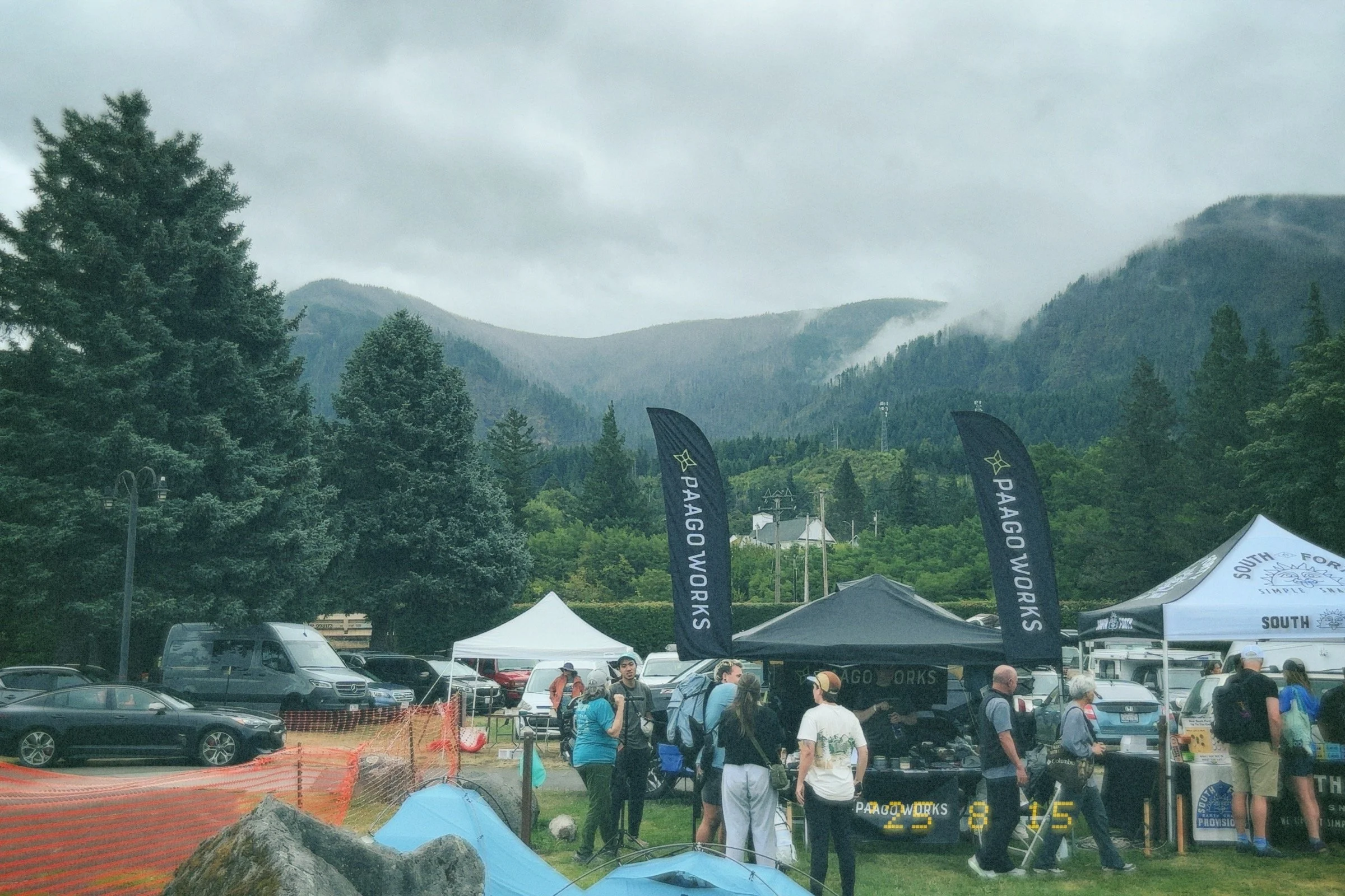
PACIFIC CREST TRAIL DAYS 2025 - CASCADE LOCKS, OREGON
Methodology
In-person interviews were conducted at Pacific Crest Trail Days in Oregon, an event that brought together both amateur and experienced outdoor enthusiasts:
Amateur users struggled with understanding what items were necessary and how to choose between options,
Experienced users sought more precise, customizable information to align products with their specific preferences.
User Pain Points
Overwhelming Research
Users struggle to identify what gear is necessary and must spend significant time researching across fragmented sources, creating confusion and delaying decision making.
Lack of Alignment
Users find it difficult to determine whether a product is suitable for their specific trip conditions, skill level or environment due to generic product information.
Fragmented Information
Users rely on multiple sources to understand outdoor activity gear requirements, creating a disconnected experience that increases effort and reduces confidence.
Inefficient Navigation
Users encounter difficulty navigating platforms due to weak filtering systems, poor mobile optimization, and incomplete product information, limiting their ability to compare and select gear effectively.
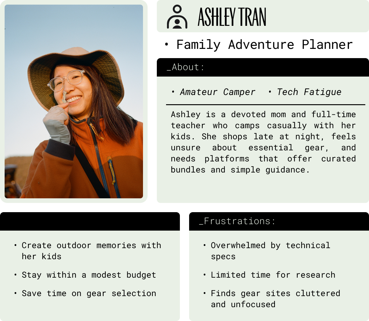
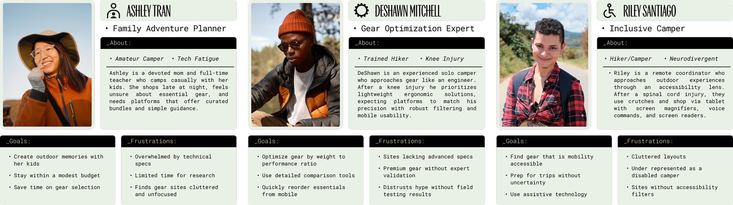
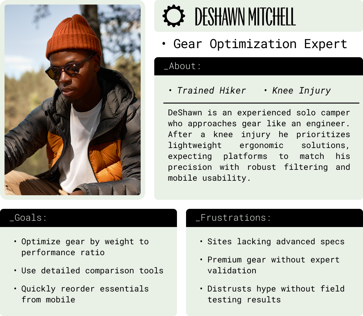
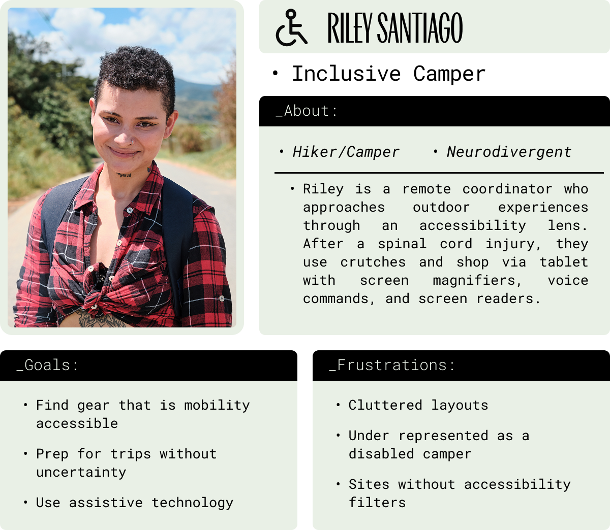
User Personas
User pain points identified through user research were synthesized into three distinct personas to represent key behavioral patterns, clarify user goals, and ground decision making context within the design process.
Competitive Analysis
To identify gaps in the current outdoor retail market, I audited five platforms: REI Co-op, Backcountry, Public Lands, OutdoorGearLab, and Amazon. Each was evaluated on user experience, accessibility, navigation, and brand identity.
Key Needs Lacking
Personalized and adaptive shopping experience
Guided purchasing for varying skill levels and physical needs
Consistent brand identity across the full user journey


Key Differences Observed
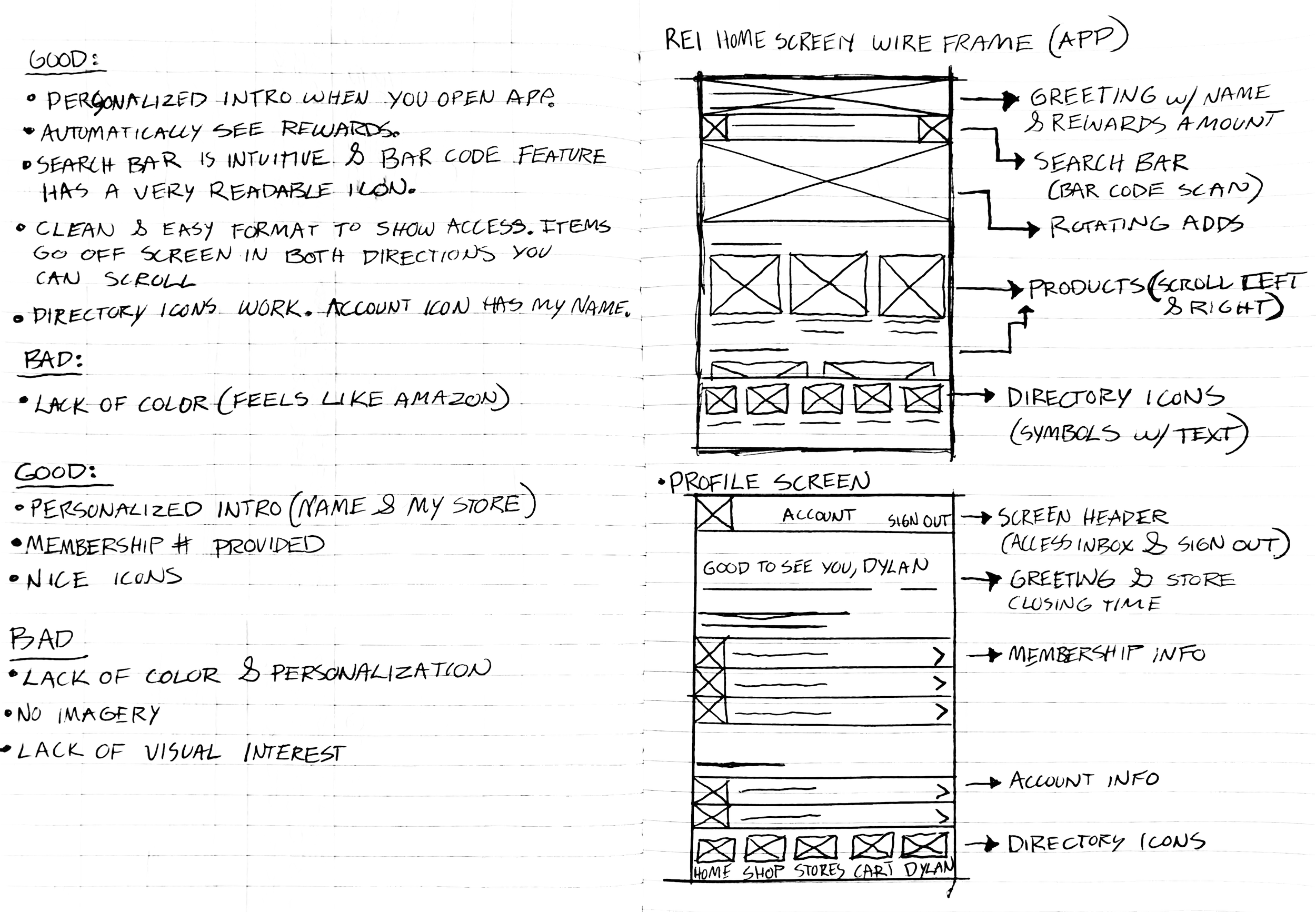
Accessible Filtering vs. Overwhelming Product Volume
Guided Purchasing vs. Self Directed Navigation
Consistent Brand Identity vs. Fragmented Visual Experience
Personalized Recommendations vs. Generic Product Listings


COMPETITIVE ANALYSIS STUDY - REI APP
Key Needs Met
Responsive mobile experience
Basic product filtering and categorization
Image based accessibility support

A sitemap was constructed to establish the overall structure and navigation of the app. This foundation then informed the user flows in conjunction with the user personas, mapping how each user moves through the application to achieve their goals.
Information Architecture
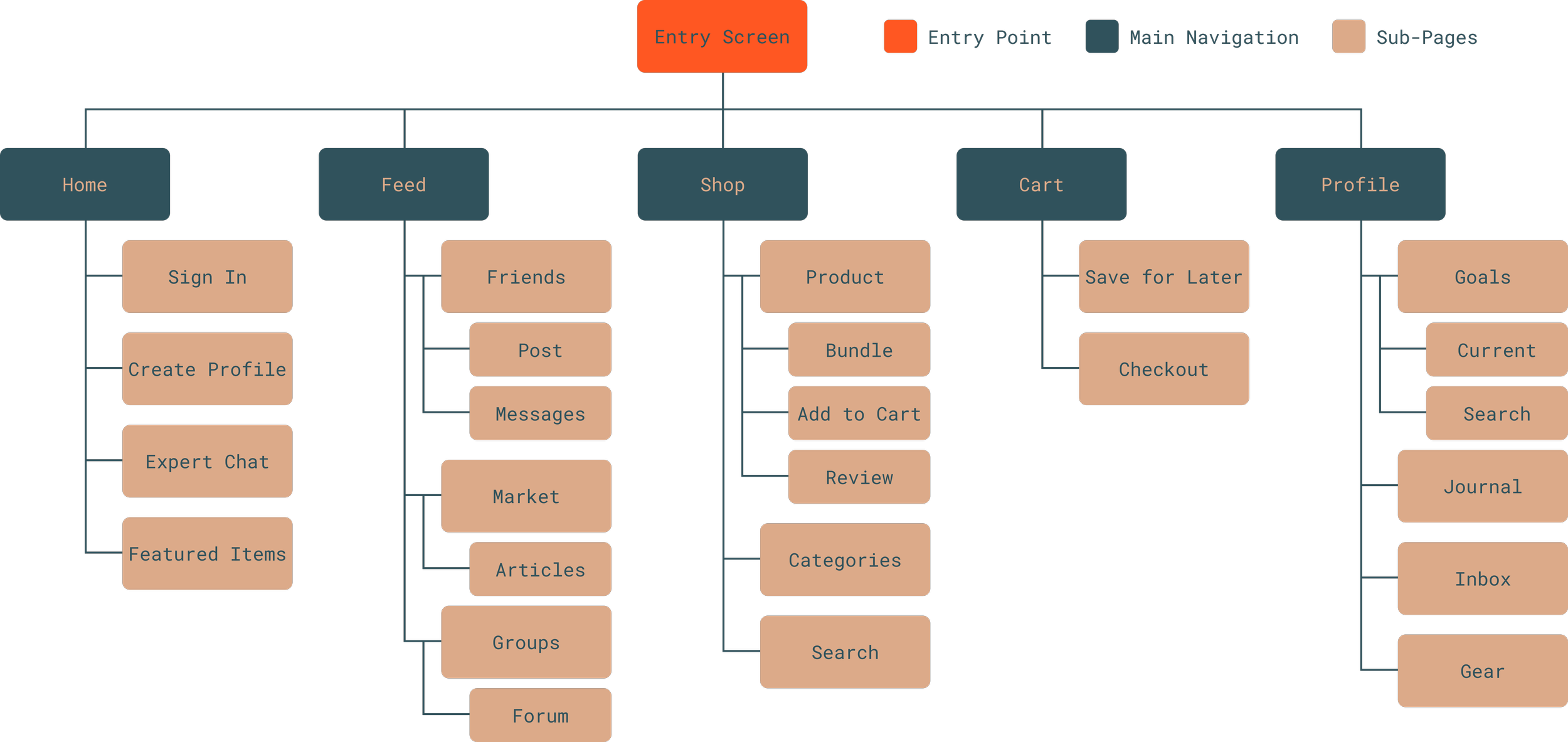
APPLICATION SITE MAP - FIRST ITERATION
User Journey - Ashley Tran
Goal: Buy the right camping gear for a weekend trip with her kids
Ashley's journey highlights the importance of a guided and intuitive experience for users who are new to outdoor shopping. By relying on suggestions and information provided by her shopping platform, she is able to make a confident and informed purchase.
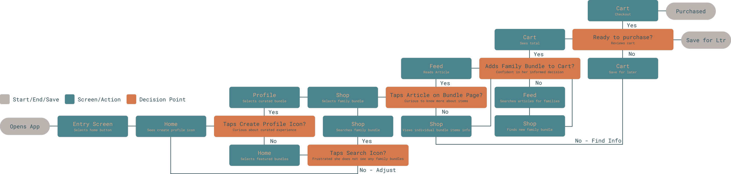
USER JOURNEY MAP - ASHLEY TRAN
Low-Fidelity Insight & Iteration
Paper wireframes were developed to translate those journeys into early screen structures. This phase focused on layout and hierarchy.
Storyboard
Prior to developing wireframes, a storyboard was created for each persona to convey real world app usage.
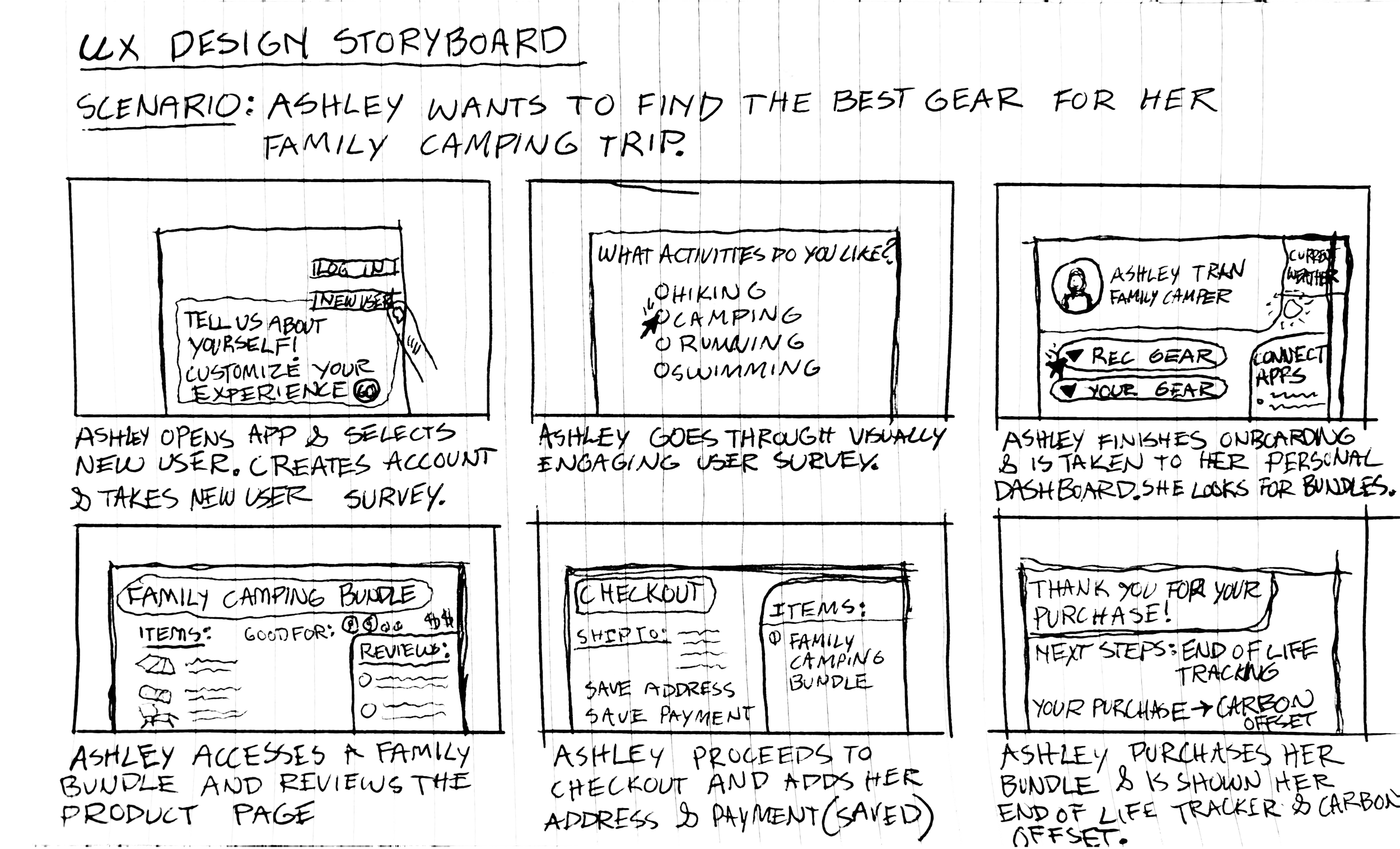
UX DESIGN STORYBOARD - ASHLEY TRAN
Paper Wireframe
Paper wireframes were sketched to establish each user journey. These wireframes were then translated into the first iteration of the main navigation to begin forming the structure and design language of the application.
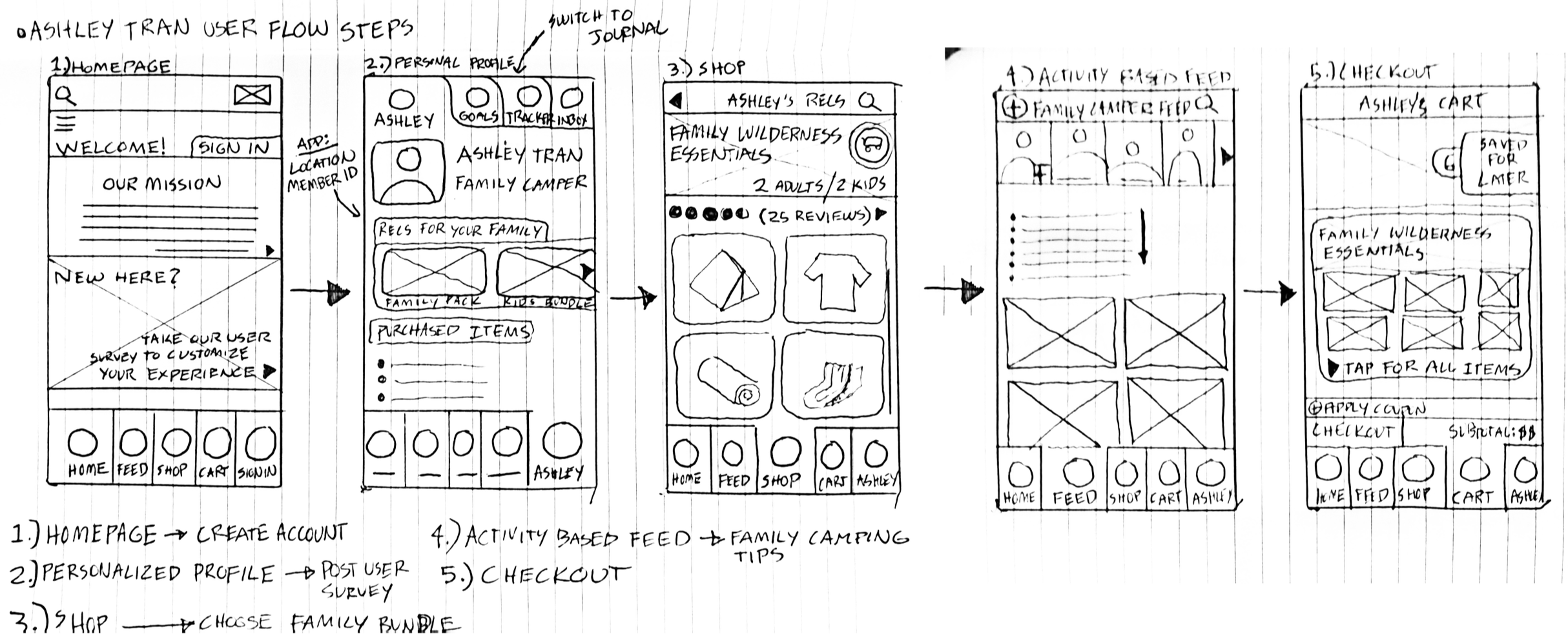
USER FLOW WIREFRAME - ASHLEY TRAN
Digital Wireframe - Figma
From pen to pixel, paper wireframes were translated into low-fidelity wireframes through Figma. Function begins to be defined by form as the application takes shape and is formatted for a mobile device.
FIGMA - WORKFLOW FOR ASHLEY TRAN (WIREFRAME TO PROTOTYPE)

Digital Wireframe - Figma
Low-Fidelity
Each low-fidelity wireframe was directly informed by its corresponding user persona. Ashley's flow prioritizes guided onboarding, curated bundle discovery, and a simplified checkout. This process was repeated for each persona to iterate the application by various user types.
From pen to pixel, paper wireframes were translated into low-fidelity wireframes through Figma. Function begins to be defined by form as the application takes shape and is formatted for a mobile device.
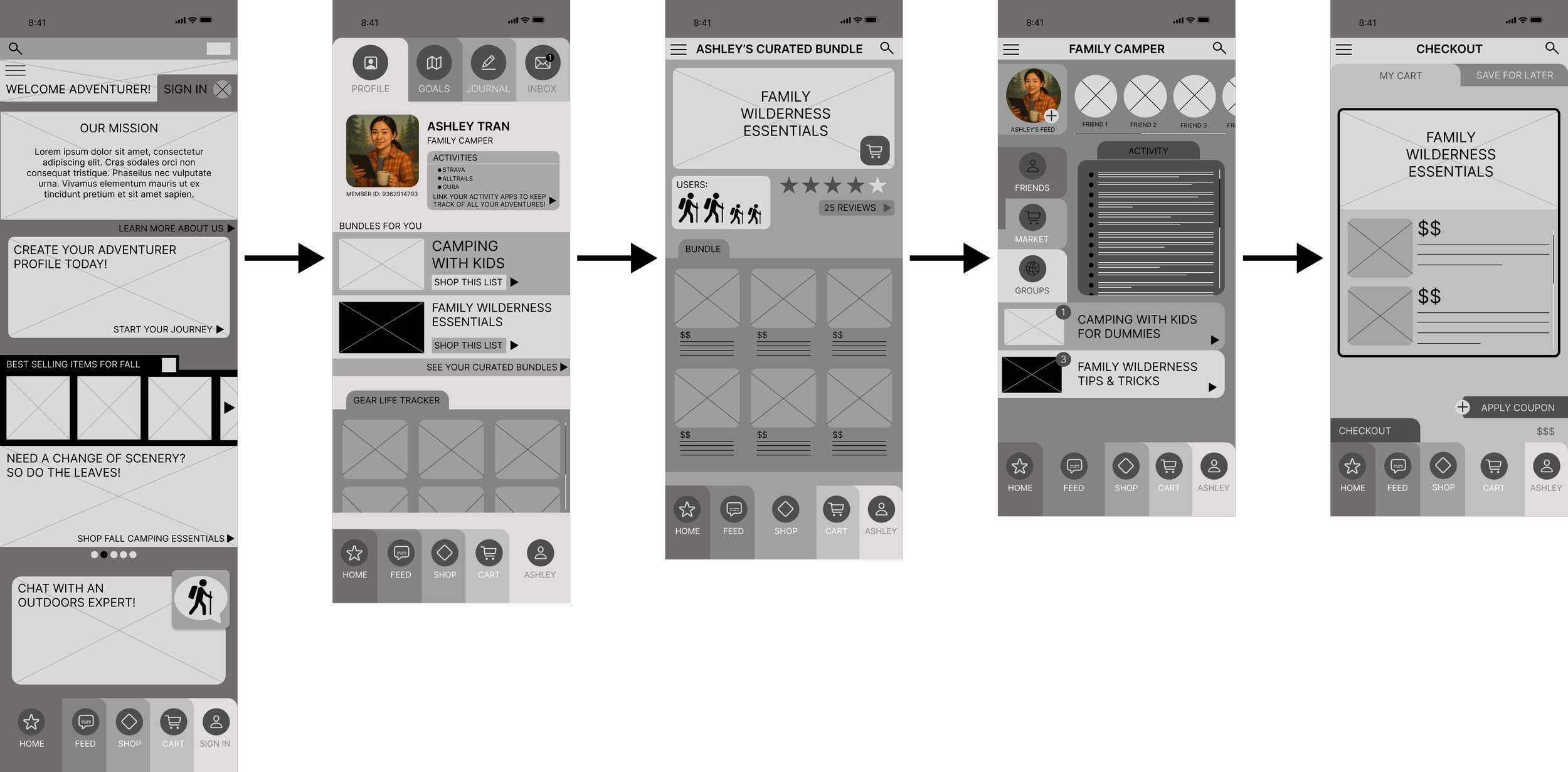
USER FLOW LOW-FIDELITY WIREFRAME - ASHLEY TRAN
Wireframe to Prototype
User flows were consolidated into three distinct interaction paths: Purchase, Profile, and Info. These paths represent how different users move through the core navigation, translating the wireframes into a connected prototype ready for testing and iteration.
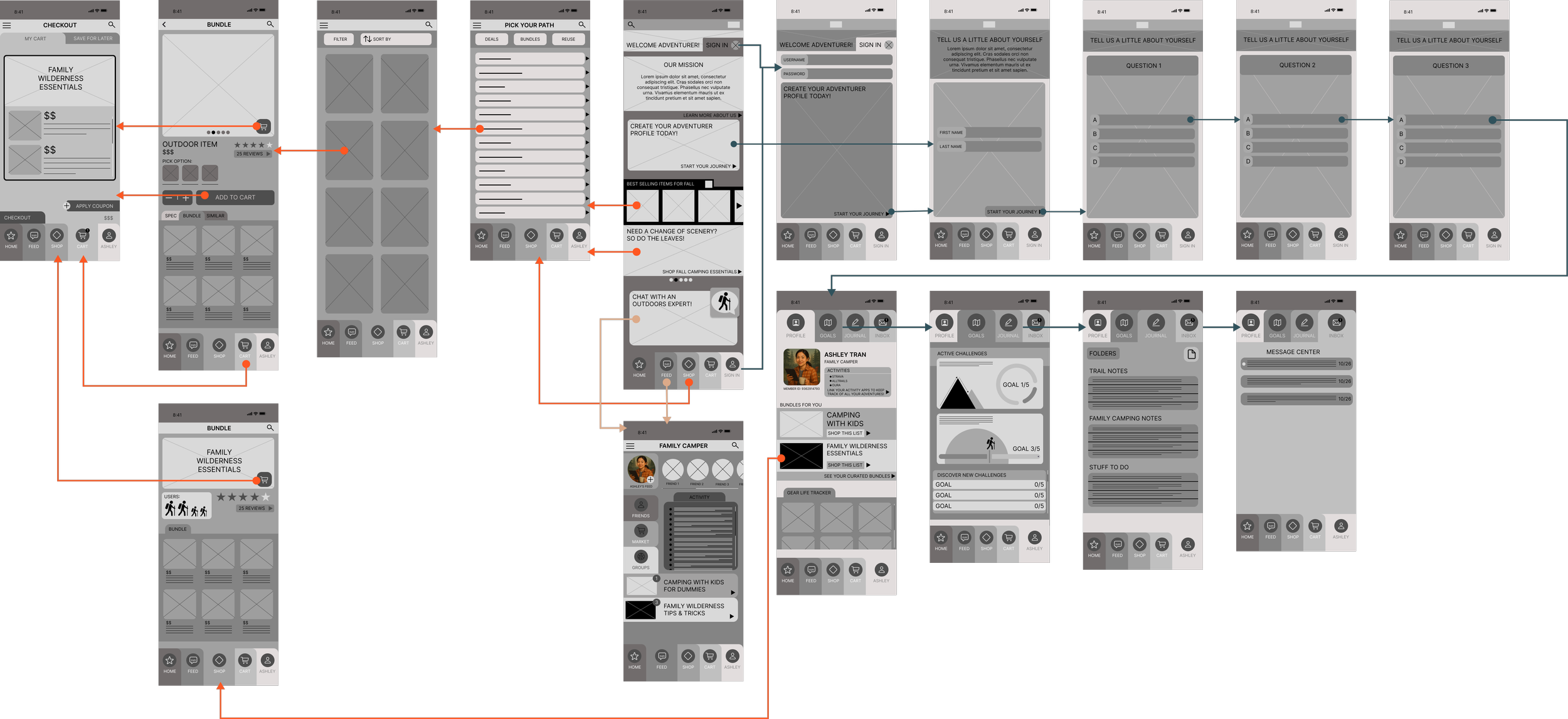
LOW-FIDELITY PROTOTYPE - PURCHASE, PROFILE, INFO
Insights & Iteration
An unmoderated usability study was conducted with five participants ranging from beginner to experienced outdoor enthusiasts. Participants completed a series of prompts through the app on their mobile devices, followed by a System Usability Scale survey to measure ease of use and overall satisfaction. The findings revealed four key insights that required design iteration.
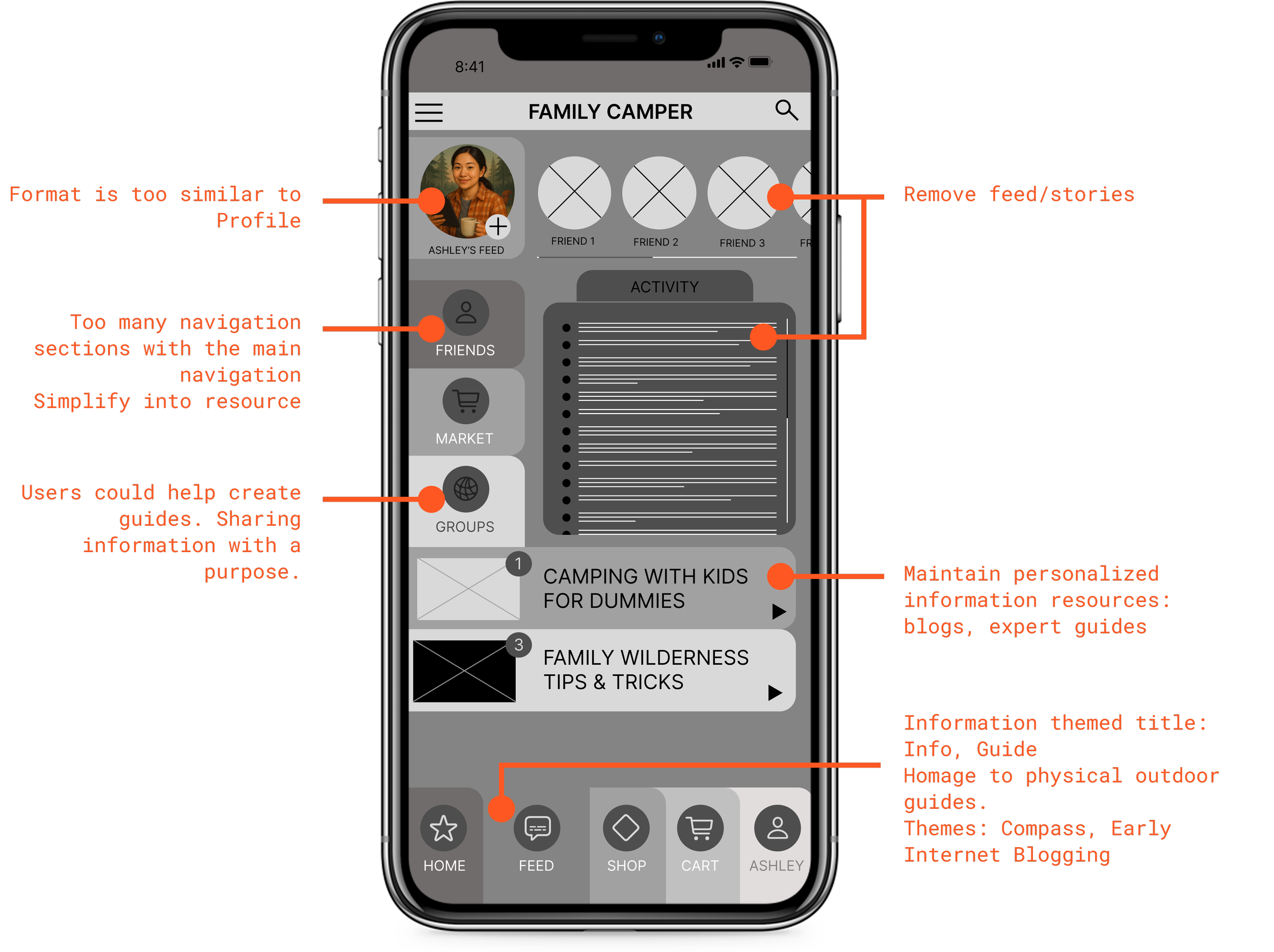

Replace the Feed
Users did not want another social media experience. They wanted purposeful information and community knowledge.
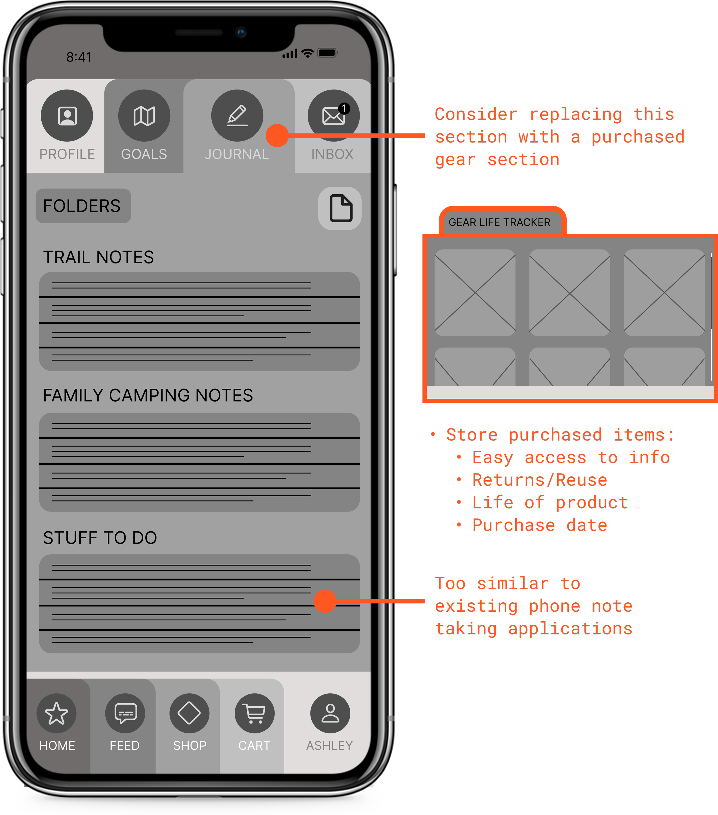

Redefine the Journal
The journal feature felt redundant alongside native phone note applications. Users expected every section of the app to serve a distinct purpose.
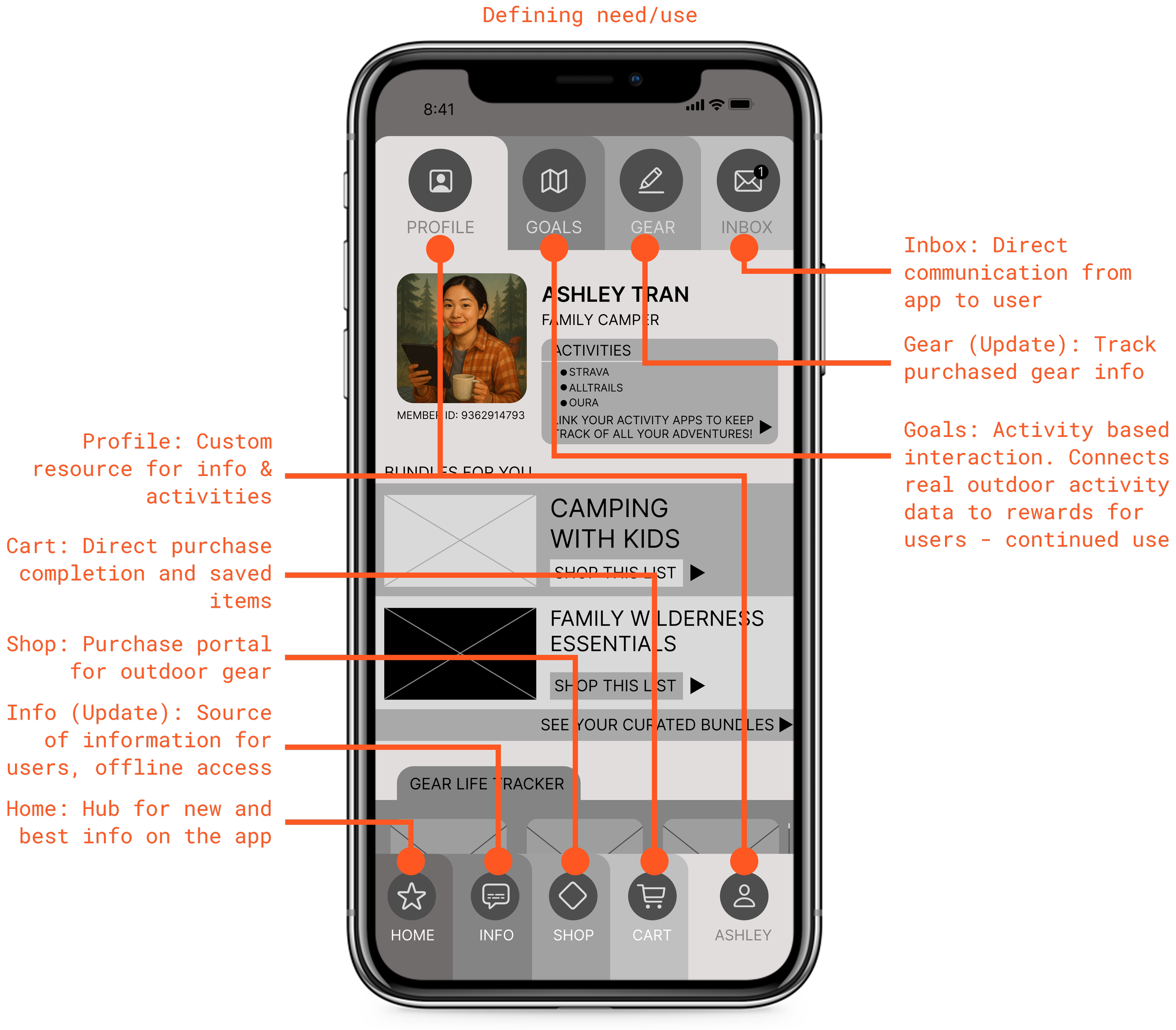

Purposeful Need
Participants pushed back on features that lacked clear utility. Each navigation point needed to justify its presence.
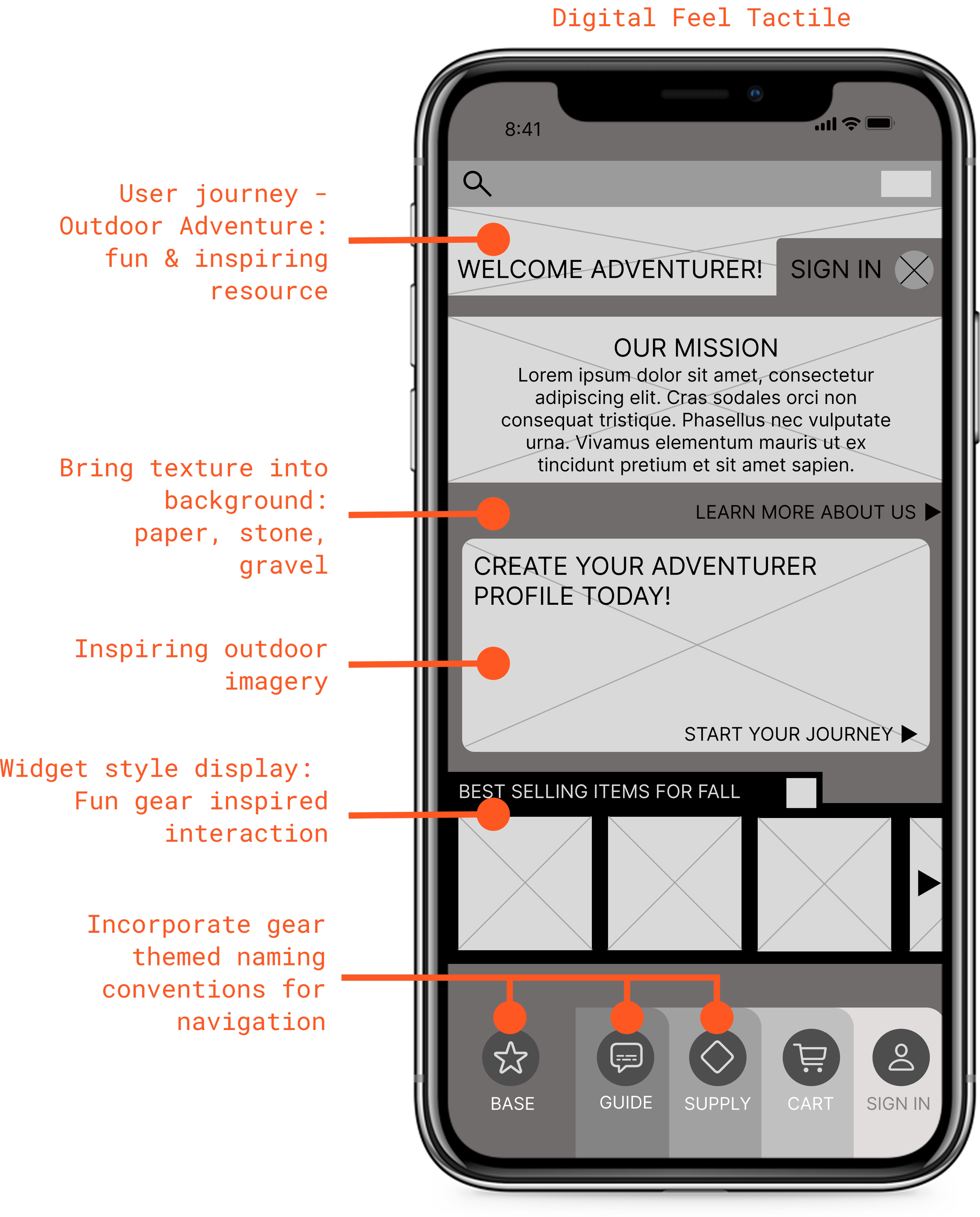

Digital to Tactile
Users wanted the app to feel like a trusted outdoor resource. The experience needed to carry the same purposeful utility as the gear it was designed to help them find.
Building the Brand
Once a low-fidelity prototype had been created, it was time to define the brand concept that would drive the functionality forward into high-fidelity.
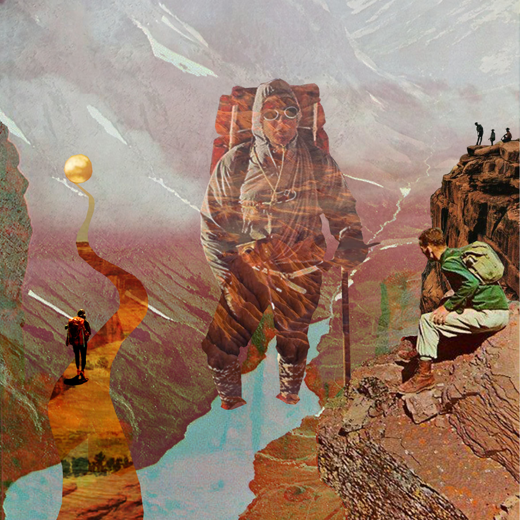
CONCEPT COLLAGE - ADVENTURE’S PATH
Concept: Adventure’s Path
The concept draws direct inspiration from the user journey itself, translating the experience of outdoor exploration into a visual design language. Grounded in the heritage of vintage outdoor aesthetics, the concept pays homage to the gear, cartography, and visual culture of past explorers, bridging that timeless spirit into the context of a modern digital experience.
PATH is designed to feel like it belongs in your pack alongside your other gear: familiar, trusted, and built to last.
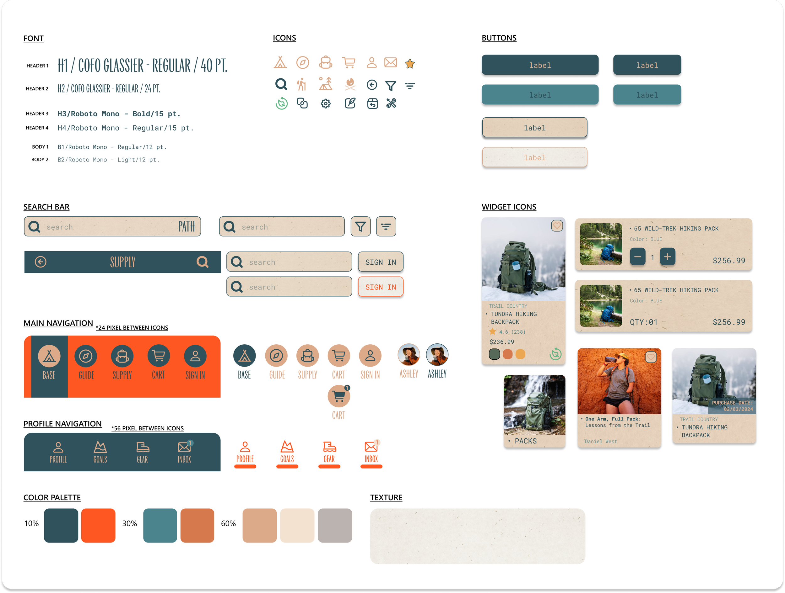
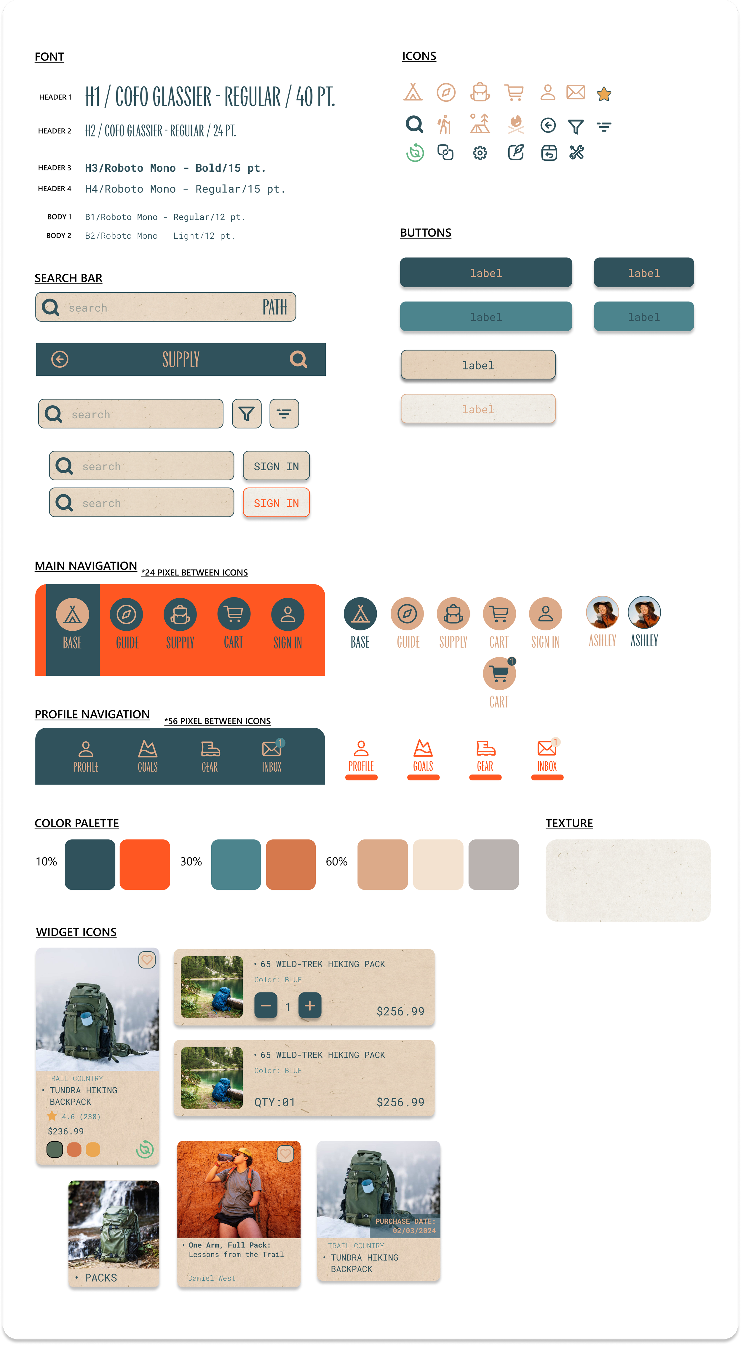
Design System
Branding elements were unified to create the design system for the user interface of the application, harnessing elements of nature, vintage gear culture, and tactile experience. This system informs the application's structure and the user's interaction, embodying the guiding principle of making the digital feel physical.
Concept Realized - Twinmotion
The Adventurer's Path concept was brought to life through a series of fully realized campsite environments built in Twinmotion. Drawn from vintage outdoor photography and the visual culture of past explorers, each environment translates that analog inspiration into an immersive digital experience. These animated campsites appear throughout the app as backdrops to bundled gear, inviting users to visualize themselves in each setting and shop for gear in the context of where they actually plan to use it.
Concept Realized - Twinmotion
The Adventurer's Path concept was brought to life through a series of fully realized campsite environments built in Twinmotion. These animated campsites appear throughout the app as backdrops to bundled gear, inviting users to visualize themselves in each setting and shop for gear in the context of where they actually plan to use it.
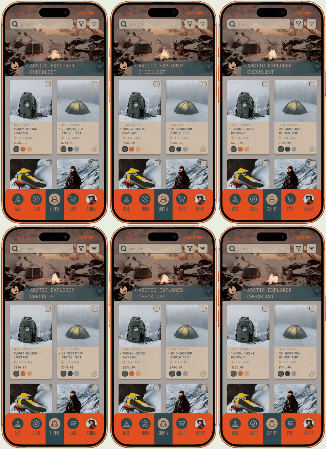
Arctic Explorer
Built for the most demanding conditions, this environment places users in a remote alpine campsite surrounded by snow covered peaks and frozen terrain. This setting guides users toward cold weather essentials.
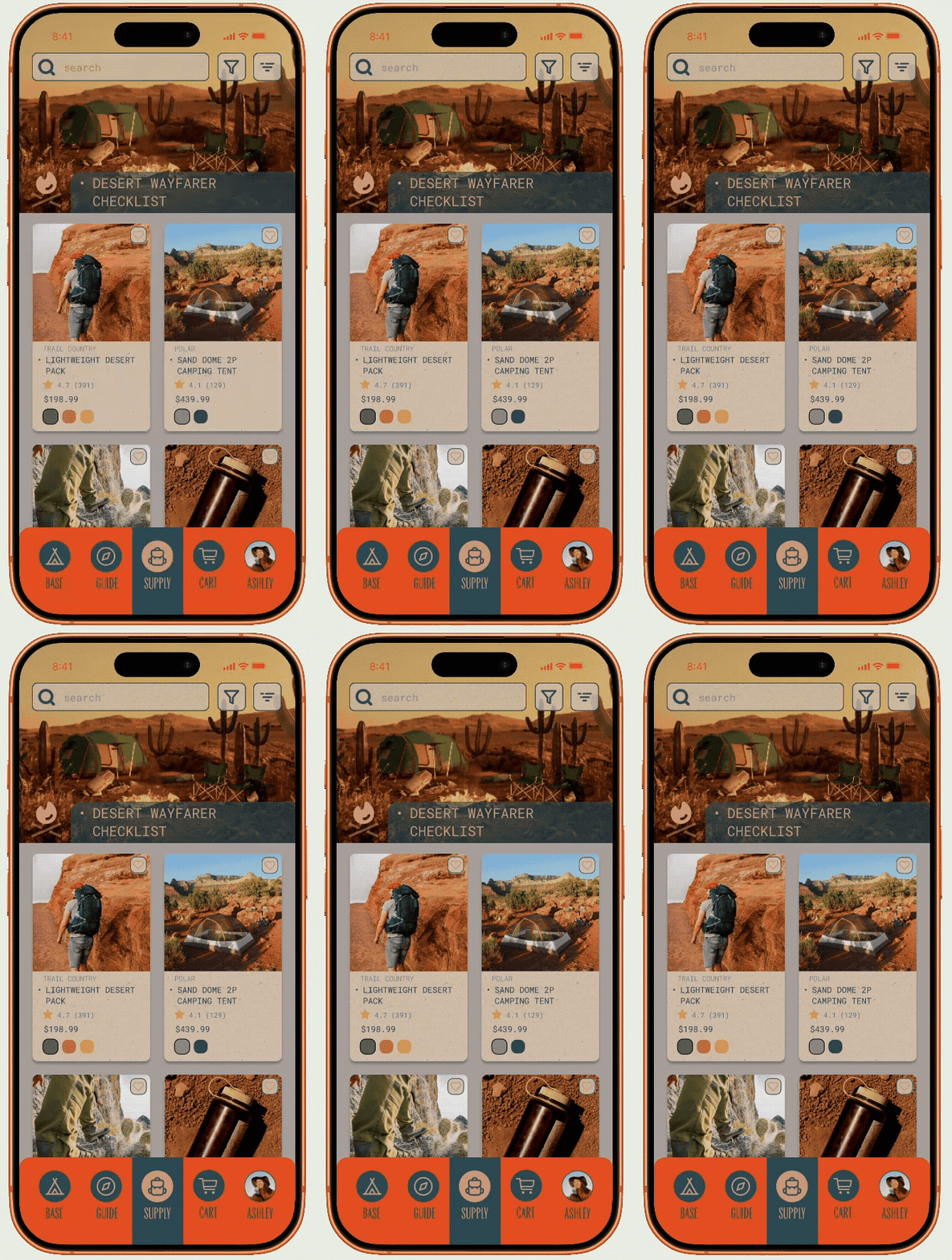
Desert Wayfarer
Desert Wayfarer
Built for the heat and solitude of open desert terrain, this environment places users among sun baked canyons and sheer rock faces made for climbing. This setting guides users toward the essentials of desert exploration.
Built for the heat and solitude of open desert terrain, this environment places users among sun baked canyons and sheer rock faces made for climbing. This setting guides users toward the essentials of desert exploration.
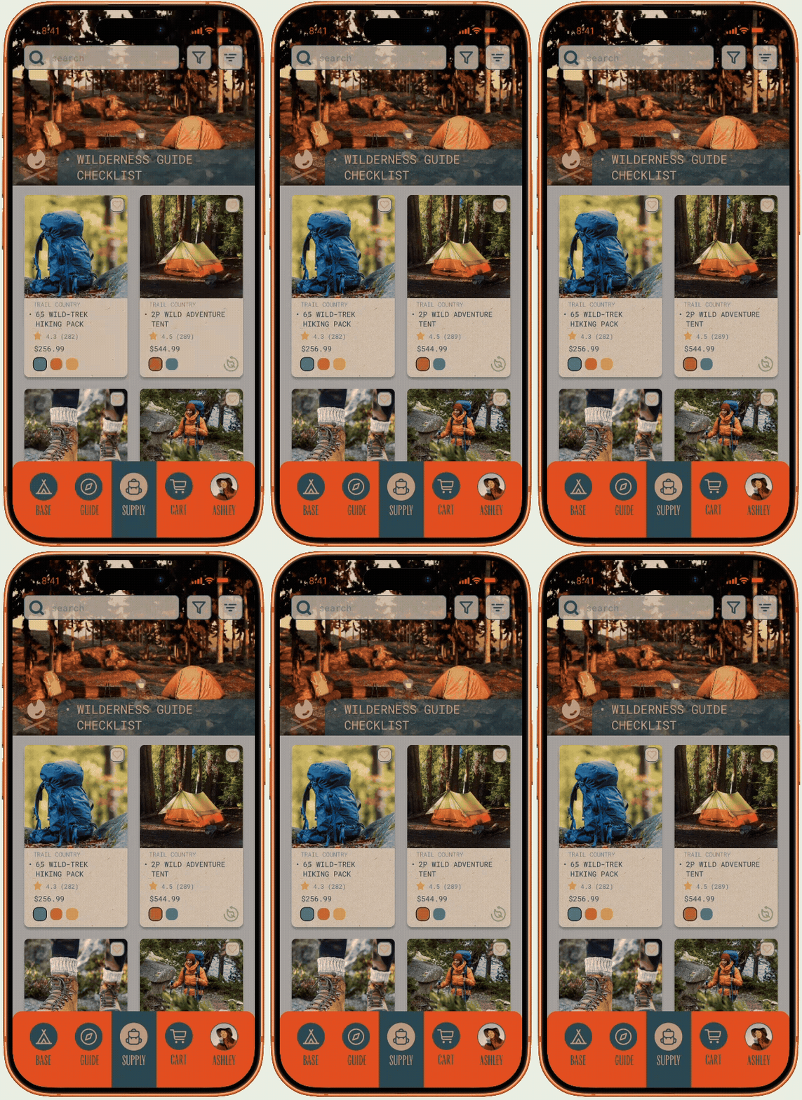
Wilderness Guide
Designed for the depth and solitude of old growth forest, this environment places users among towering pines and rocky terrain. This setting guides users toward the essentials of backcountry wilderness.
Wilderness Guide
Designed for the depth and solitude of old growth forest, this environment places users among towering pines and rocky terrain. This setting guides users toward the essentials of backcountry wilderness.
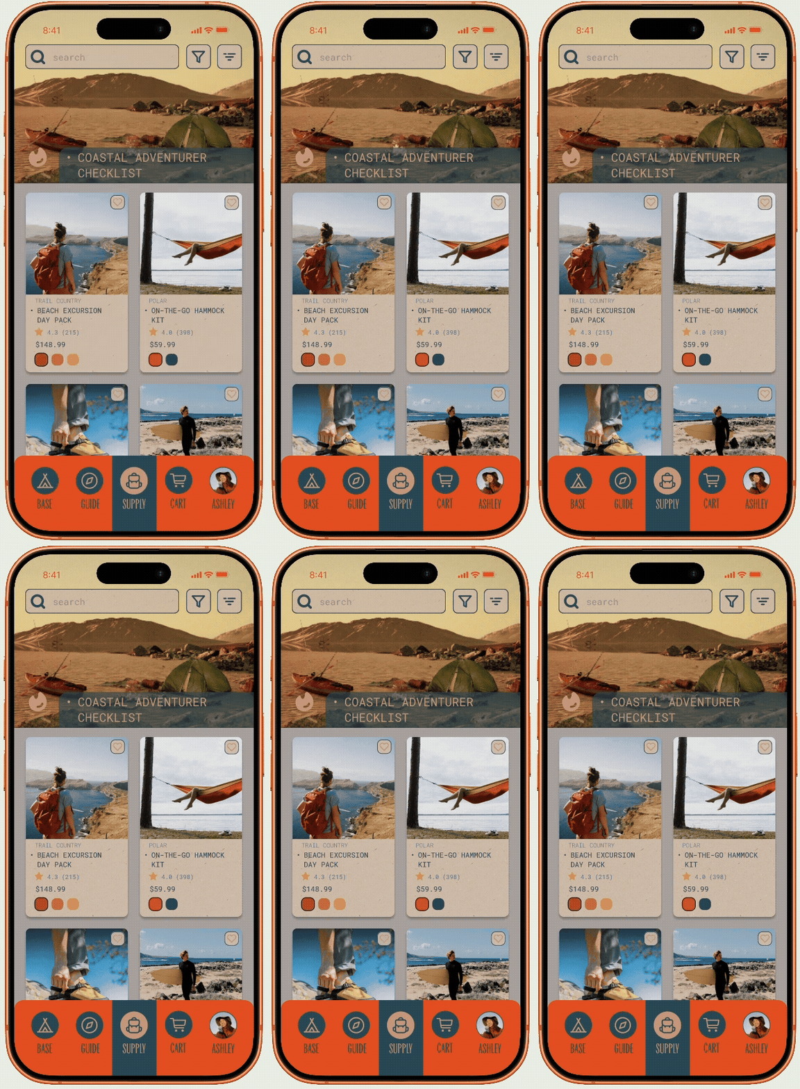
Coastal Adventurer
Designed for those drawn to the water's edge, this environment places users on a remote shoreline campsite complete with kayak and open coastal terrain. This setting guides users toward water ready essentials
Coastal Adventurer
Designed for those drawn to the water's edge, this environment places users on a remote shoreline campsite complete with kayak and open coastal terrain. This setting guides users toward water ready essentials
Arctic Explorer
Built for the most demanding conditions, this environment places users in a remote alpine campsite surrounded by snow covered peaks and frozen terrain. This setting guides users toward cold weather essentials
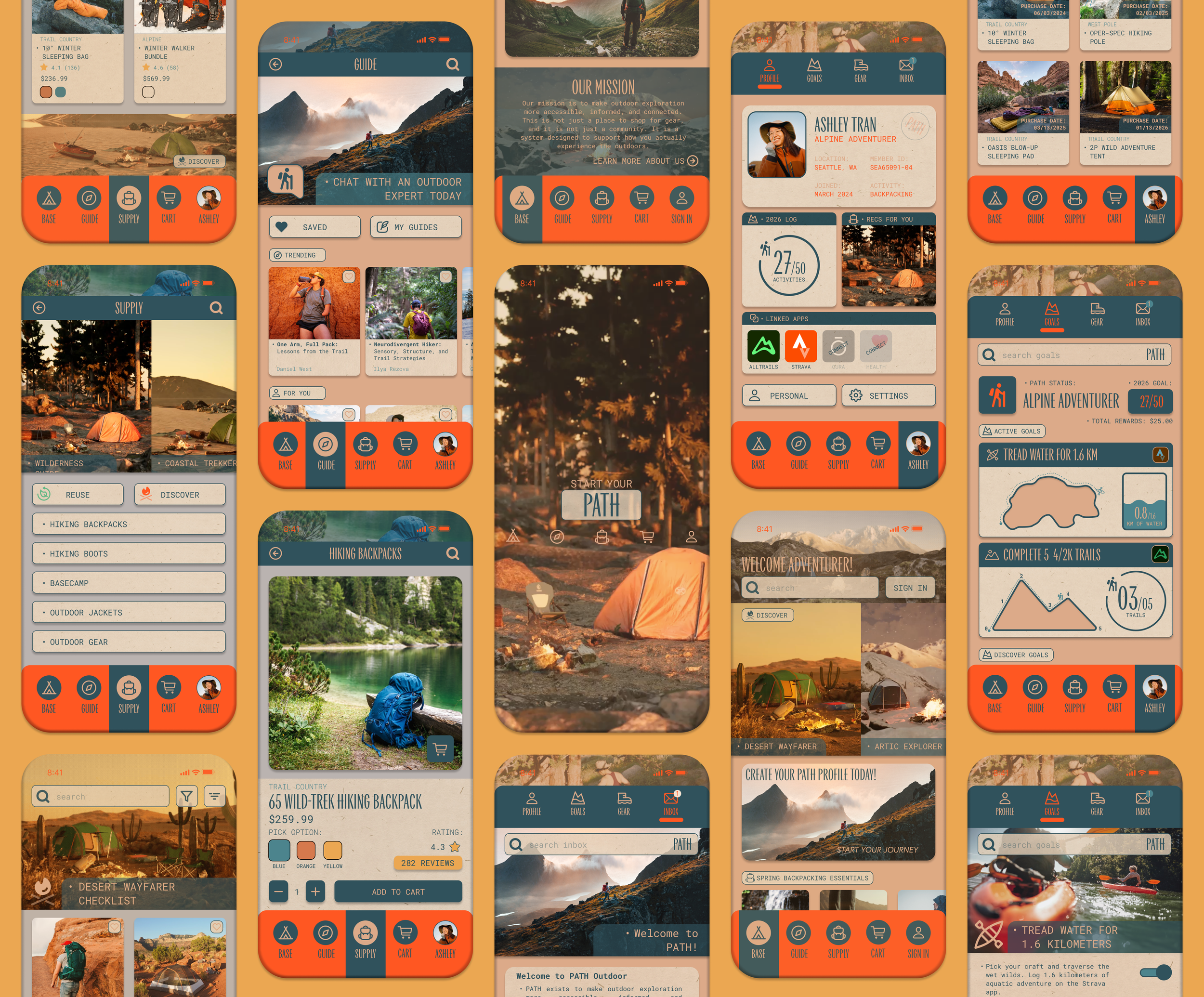
Brand and form merge to create the final product of the design process, a high-fidelity prototype informed by user flows and journeys. The interactive model utilizes the user persona of Ashley Tran to convey the multitude of paths a user can take to make their informed gear purchase.
Final Design
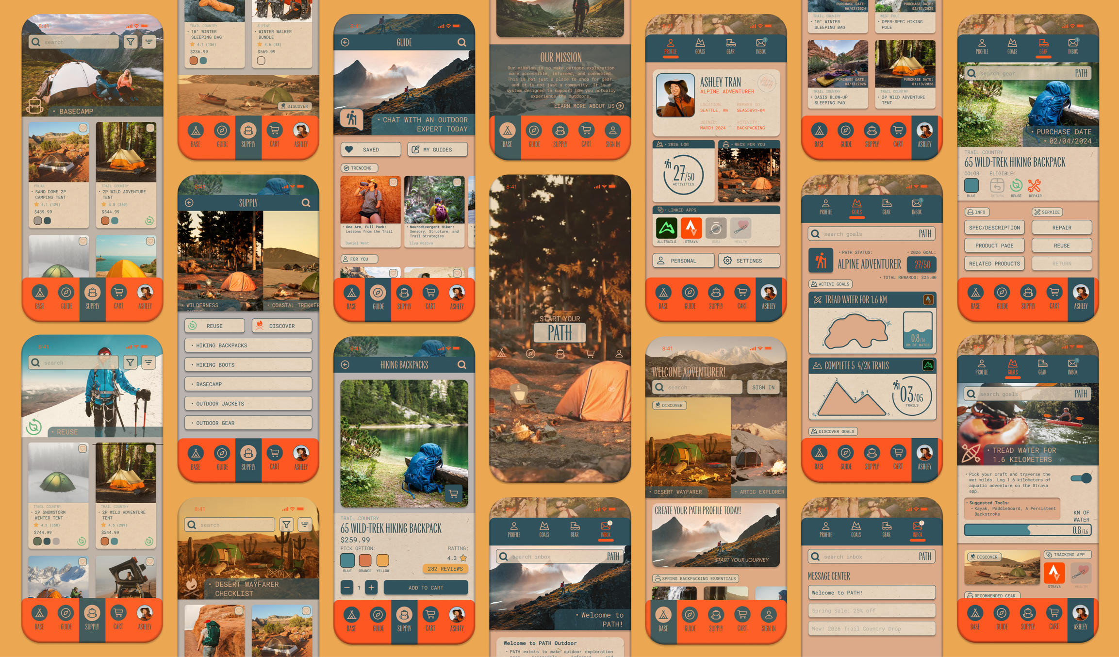
Final Design
Brand and form merge to create the final product of the design process, a high-fidelity prototype informed by user flows and journeys. The interactive model utilizes the user persona of Ashley Tran to convey the multitude of paths a user can take to make their informed gear purchase.
Goals
The four goals established at the outset of this project served as the north star for the purpose and need of the application. The high-fidelity prototype demonstrates how each goal was addressed:
Create a guided purchasing experience that helps users make informed outdoor gear decisions
Develop a visual system that establishes a consistent UI language
Design an intuitive architecture that is understood by all user types
Support ongoing engagement tools that extend beyond one-time transactions
USER FLOW - PROFILE PURCHASE
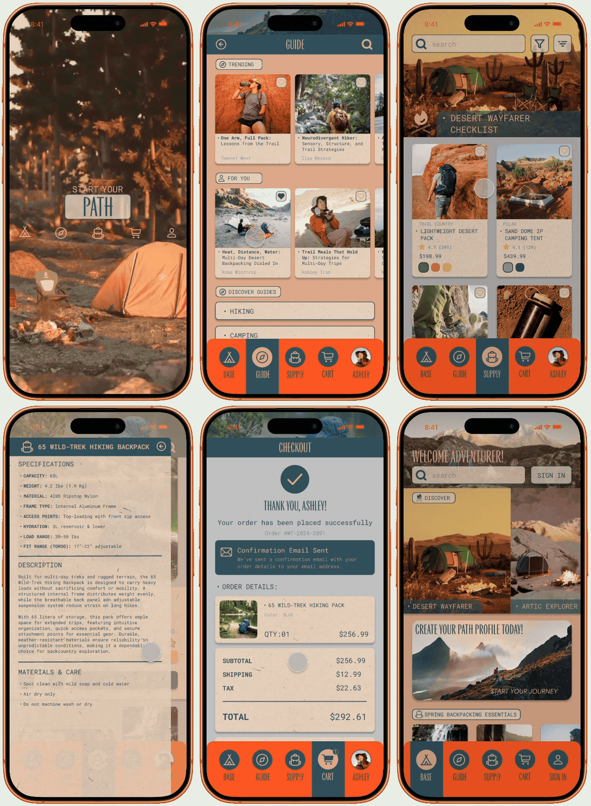
USER FLOW - GUIDE PURCHASE
Goal 1: Guided Experience
Guided recommendations and contextual information support users at every stage of their decision-making, ensuring every purchase is backed by knowledge rather than guesswork.
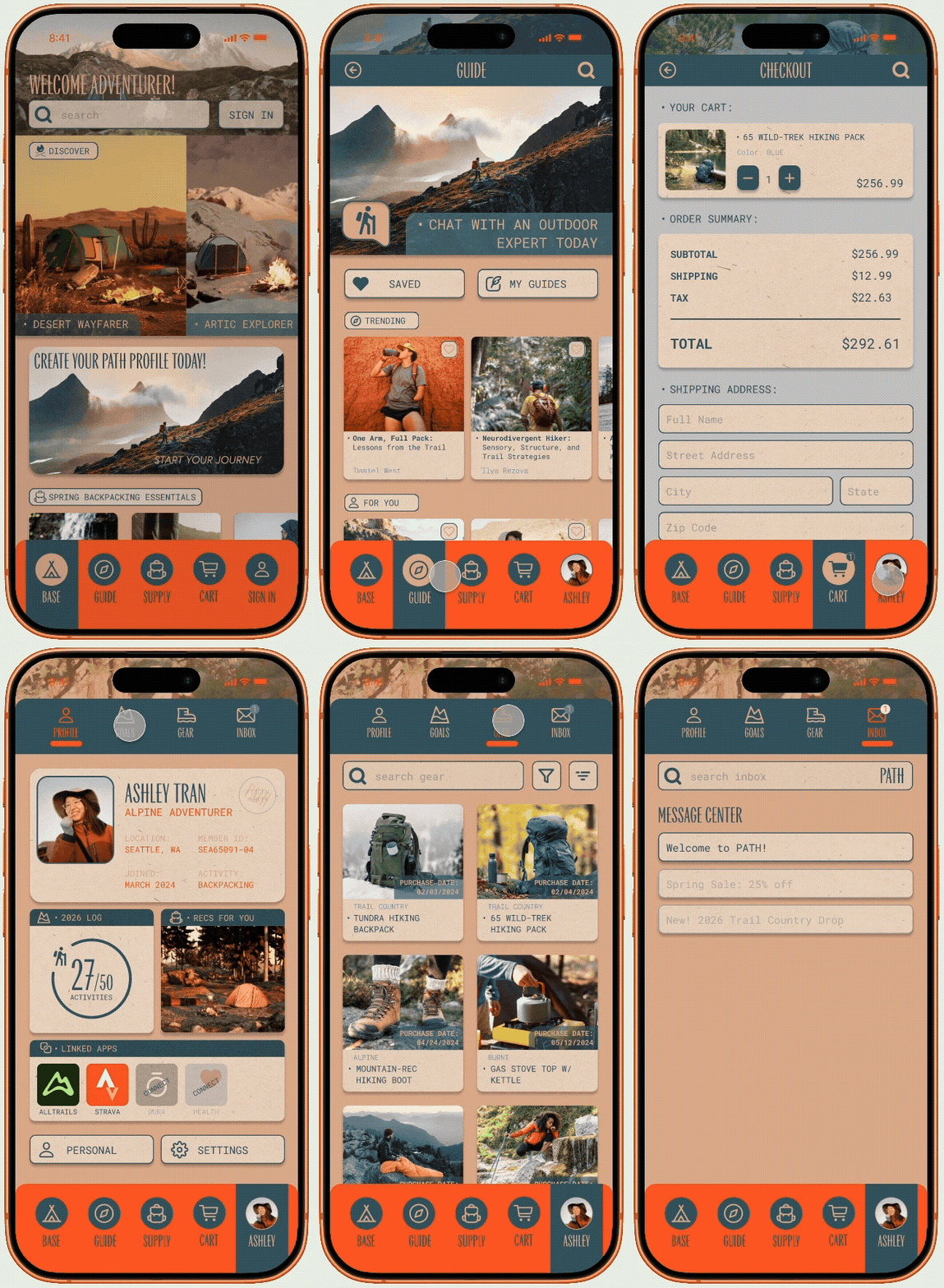
MAIN NAVIGATION
Goal 2: Cohesive Sytem
The interaction system utilizes color, contrast, and form to establish a consistent visual language across every screen and navigation state. The language of the PATH brand is carried throughout the design while also helping guide users on their journey through the application.
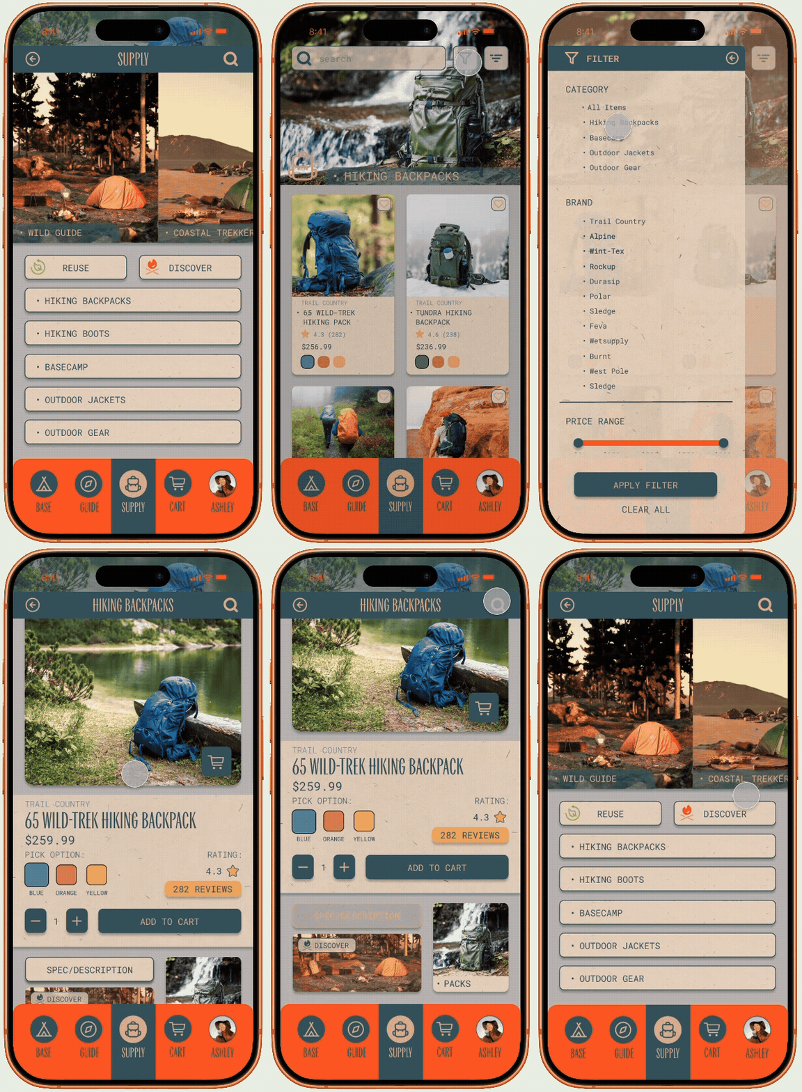
DIVERSE INTERACTION METHODS
Goal 3: Intuitive Architecture
The information architecture communicates hierarchy through deliberate visual cues. Buttons utilize drop shadows and color weight to distinguish primary actions, while pop-up menus overlay the interface to surface priority content. The design encourages multiple interaction methods through swiping and tapping, allowing for greater universal autonomy across all user types.
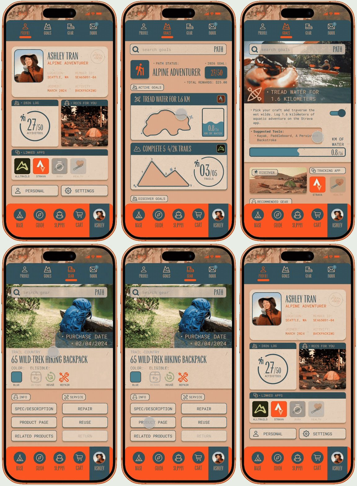
ENGAGEMENT - GOALS & GEAR
Goal 4: Ongoing Engagement
PATH extends beyond the transaction through two core profile features. Goals connects to the user's health apps, translating activity data into personalized challenges and rewards. Gear serves as a living hub for all purchased items, a reliable resource whether packing for a trip or troubleshooting in the field.
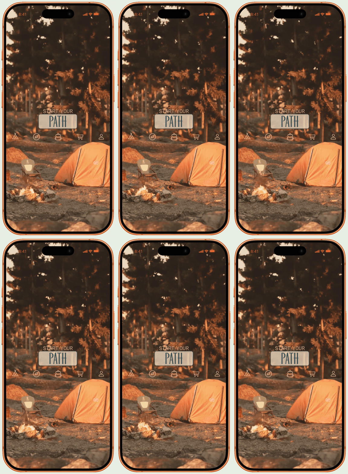
Figma Prototype
To see the prototype in action, select the button below for the Figma based High-Fidelity Prototype of Path Outdoor